Wednesday, January 20, 2016

Wednesday Inspiration {SW Storm Cloud}

Moody Blue.
Touch of Gray.
Sherwin Williams "Storm Cloud" is a beautiful changing color...depending on the light in the room it can read either blue or gray. It adds depth and character, is a perfect pairing with crisp white for contrast.

Paint Color SW 6249 Storm Cloud from Sherwin-Williams. I used this in a master bedroom I just redesigned and it is beautiful & was so easy to apply. I am a SW paint fanatic now!:


Laundry Room After. This girl's blog has so many pretty before/afters that are decor/design only and not actual renovations. LOVE.:
via
Yellow Cape Cod
Island with cooktop, room for trash bins on side. Replace oven area with drawers for pans and utensils.:
viaHouzz
via
AK Interior Design


Tuesday, January 19, 2016

Client Project {MS Kitchen Renovation}

This client has existing backsplash, granite counters and cabinetry but is looking for a refresh.  We will add new faces and paint cabinets and drawers, reface and add color to the kitchen island, remove existing (non-functional work space) and replace with double oven, microwave wall, change hardware and light fixtures.  Additionally, they will be refinishing their existing hardwood Hickory Honey colored floors to an updated, non yellowish finish.

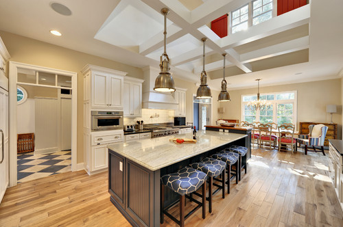
Here are design pictures that are serving as our inspiration point for this remodel.
She is drawn to what I call "New Traditional". Updated colors and finishes but with Traditional style elements.

White Cabinetry: Sherwin Williams "Alabaster".
Kitchen Island: She would like to go a bit more gray than blue, so we are zeroing in on Sherwin Williams "Storm Cloud"
Her existing wall color is a soft beige as in these inspiration pics. The wall color will remain existing in the space.

Lighting and hardware in updated yet Traditional/Farmhouse Industrial Style in Nickle or  Chrome.


Traditional Kitchen by Millbrook Architects & Building Designers Crisp Architects


The end result will be a bit darker than the above inspiration pictures due to the client's existing wall color, darker granite and backsplash. But a face lift incorporating lighter cabinetry that compliments the existing elements will lift this kitchen out of it's nondescript, sort of non-styled, honey-toned monochrome existence into a warm, light family hub.


Traditional Kitchen by Naples Cabinets & Cabinetry Design Studio by Raymond

I'll be updating with Lighting, Hardware and flooring details as the project progresses.
Happy Renovating!
XO,


Thursday, January 14, 2016

Thursday Window Shopping 1.14.16: High Style in the kiddie section

Statement Lighting is a big thing in design currently.
The problem? Hot lights (no pun intended), can be easily over $1000.
My solution for high end design with decent quality for a lot less is to look at the Children's Divisions of popular brands. Most major retailers that have children's divisions have copy-cat designs in their children's sections for a lot less than the "Grown Up" versions. Specifically: Restoration Hardware Baby and Child, Pottery Barn Kids and PB Teen , Anthro's little sister Urban Outfitters and the Crate & Barrel owned Land of Nod.

Be sure to read the details regarding size of fixture and materials, but for a high end, stylish design you pay significantly less when you shop in the kiddie section.

La Boheme Crystal Chandelier
PB Teen
$299

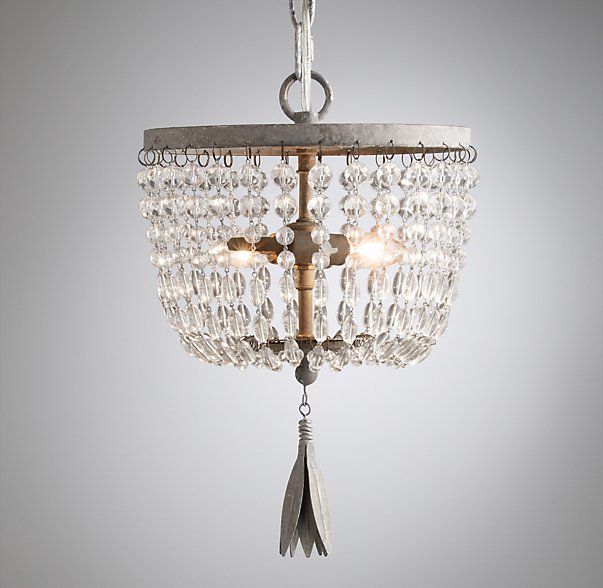
Dauphine Crystal Small Pendant
Restoration Hardware Baby & Child
$133
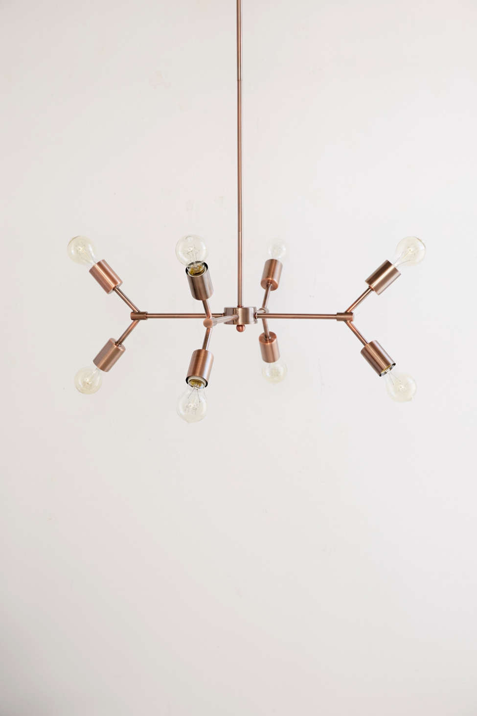
Glass & Metal Cage Pendant
Pottery Barn Kids
$349


Urban Outfitters
$149

Between a Rock and a Lamp Base (Wood)
Land of Nod
$79

Happy Hunting!
xo,

Thursday, January 7, 2016

In the Buff: Buffalo Check

Buffalo Check Bias, Black & Cream
Buffalo Check Pillow  by Tonic Living
Cut on the Bias keeps it sophisticated.
Black and Ivory keeps it crisp, not cutesy.

Yes, it is everywhere. It is a trend. But Buffalo Check has been around in high style design for ages. 
Buffalo Check is a larger scale than Gingham. 
It's hot now in terms of the rustic, lumberjack craze.

But designers such as Caitlin Wilson and Studio McGee are keeping it fresh and sophisticated by pairing it with florals.  
black burnside buffalo check pillow
Caitlin Wilson Textiles

This isn't anything new...Buffalo Check and florals was THE staple of French design for decades in the 70's-90's.
Blue, Toile, and plaid play in this gorgeous bedding! Pair white trow to balance the prints except in red!:
 Stay away from that look. K?

Here are a few of my favorite sophisticated combinations of Buff + Florals that really work as far as punch and scale. 

 Manuel Canovas Linen Pillow on OneKingsLane.com:

Ethan Allen "Parker" Chair ~in black & cream buffalo check:


DecoratorsBest - Detail1 - Sch 174450 - Pyne Hollyhock Print - Charcoal - Fabrics - - DecoratorsBest:   Four Inch Check, Black/Natural What a handsome room by Room by T. Keller Donovan.  The floors here serve as the "blank canvas" allowing the bold and beautiful blues to really make a statement. Shaw's "Art Reflects You" is an all nylon patterned loop carpet that looks like "woven sisal" but is soft underfoot and has the great sustainability story of having recycled Anso nylon.:


rehearsal dinner tables:


Wednesday, January 6, 2016

Hello 2016!

Mora decorated for Christmas:
via
Trad Home


Hi there! I'm back from a long Holiday Break. It was so great to focus on my family over the Holidays and get a few things in REAL LIFE taken care of, but boy, have I missed blogging! I'm so excited to share more on my blog in 2016, the way I used to before our move mid-year last year and my client work kept me so busy that I had a tough time making time to blog about everything. I have so many projects to share...I just need to find a comfy spot and upload about 1000 pictures! 

Do you make New Year's Resolutions? Or maybe you're one of those amazing people who pick a word for the year and it propels you to focus on your direction for the year? This year I've decided to focus on a quote. No, it isn't a quote from Mother Teresa or Mumford and Sons. It isn't religious or profound. But hopefully it will be life altering. It is about living with purpose.

"Our time is brief, and so it will pass no matter what we do. So let us have purpose in spending it. Let us spend it so that our time matters to each of us, and matters to all those whose lives we touch". ~ Stanford Professor and Psychologist Philip Zimbardo 

This quote was a bit random, but I read through a lot of quotes, pondered them and really felt them, if that doesn't sound too New Age. This is the one I really connected with. In thinking of my personal and professional goals and reflecting on my hap-hazardly stumbling through 2015 (letting life lead me in stead of leading my life) I am making it my goal and consciously choosing to live each day with purpose. I'm setting out to make my time really matter this year. To live more purposefully and presently. 

So, here's to 2016 and to all that you'd like to achieve, be, do, see... live!

XO,