Friday, August 29, 2014

Year of Change Challenge AUGUST REVEAL {Styling Bookshelves}

This month the decorating gets going with the usual suspects (Life on Virginia StreetSuburban Bitches, and Rosa Beltran Design) and our uber talented guest designer Jade O’Connor! Her Southern style showcases her eye for mixing traditional with eclectic. I CAN'T WAIT TO SEE WHAT SHE DOES WITH HER SHELVES! 

So, here we are! Hello, last weekend of August!
And as I mentioned, this month's challenge was to style a bookshelf. 
Styling Bookshelves?!!!

 This is one of my most favorite things to do in the decorating realm. 
I love books and I love stuff. 
What people have on their shelves and how those objects are displayed says a lot about you. (For instance, my dusty shelves may indicate that I don't clean often enough, jk). Sometimes the organizing and styling task can be overwhelming when you think about attaining a look that is clean, uncluttered and balanced. Especially if you are working with collections.

 I have several bookcases in my home (because I'm a book nerd), so the biggest part of the challenge for me was to decide which shelves I wanted to tackle. 
I decided to give my living room book shelf (an old, ugly, battered bookshelf that has been through 5 moves with us) the heave-ho and tackle a bit of a DIY IKEA HACK.
For details on my IKEA Bookshelf Hack head over here.

The room that I've been working in may look familiar to you. Back in February I shared my Idea Board for this teeny, tiny Living Room to be transformed into a LIBRARY READING ROOM.


Yup, that would be a Brass Etagere in the picture above.
So, now that you know the look I'm after...here is my 
HACKED AND STYLED 
Bookshelf! 


Trust me, I have enough STUFF to fill up every inch of this shelving unit. But this is more a display etagere, so keeping things light, balanced and colorful was my goal. 

Be sure to check out Erin & Tricia's, Rosa's, Sarah's and our guest designer,  Jade's Shelf Styling magic!!!

This month's was a super fun challenge....but I seriously can't wait to share what we'll be working on and with whom we'll be collaborating with in Sept...
Monday I'll be announcing the Year of Change Challenge for September!


Thursday, August 28, 2014

Pinned It & Did It : IKEA HACK {Vittsjo Shelving Unit}

I've been loving and I mean LOVING brass etagere shelves for about a year now. It was about that time that I saw some really great pins on how to get the same look by using the IKEA Vittsjo Shelving Unit and trusty ole spray paint.

These two Vittsjo Hacks from Pencil Shavings Studio and Little Green Notebook were really getting my attention. 

So, this week I finally 
HACKED THE VITTSJO , YO!

-One Large IKEA Vittsjo Shelving Unit, $79
-2 Cans of Spray paint $24
(One coat of Liquitex Antique Gold  + a Top coat of Design Masters Gold Medal)
-And a little bit of patience to: 
1. Put the unit together (It wasn't that bad, I'd give it a 2 screws out of 5 for assembly difficulty).
2.  Let the paint dry between coats. It was so exciting to see this baby go gold that I almost rushed it. 

Here it is:

VITTSJĂ– Shelving unit IKEA Tempered glass and metal are durable materials that provide an open, airy feel.


There she is!
I'll be sharing how I styled her out for my Year of change August reveal tomorrow morning!!
XO,

Throwback Thursday: House Guests {The Haskins' Home, a Contemporary and Refined Classic Charmer}

Last Summer I shared this House Tour with you.
It was part of the Utah Valley Parade of Homes Tour.
It's so good that we are going to re-run this classic today for Throwback Thursday!!!

_______________________________________________________________________________


Shut the front door. It's a beautiful front door.
Welcome to this brand spanking new home. But it has the warmth, charm and character of a 100 year old house.  The architects of this Millhaven home, as well as the designers, Caitlin Creer Interiors and Alice Lane Home Collection, skillfully combine classic elements with fresh accessories and colors. It's not TRADITIONAL, it's not CONTEMPORARY..it's what I would call a CONTEMPORARY CLASSIC.

So, how do I define a CONTEMPORARY CLASSIC? CLASSIC major components, like marble, hardwoods, subway tile and other historical architectural elements, fixtures, lighting elements, woodwork, and furniture styles, etc. Infused with hints of CONTEMPORARY accessories such as pillows, rugs, fabrics, art work and other decorative items. Also, and this is a MAJOR tip when trying to achieve this look: TRADITIONAL PATTERNS in CONTEMPORARY PALETTES (new and simpler colorways). These formulas keep interiors fresh and light.
Can you spy Traditional staples like Quatrefoil? Ginger Jars and Glass Knobs?
Be sure to scroll through all the pictures (from the incredibly talented Cristi of Haya Papaya Photography) ...I've saved the exterior for last ;)


Wednesday, August 27, 2014

Wordless Wednesday Inspiration {Benjamin Moore Blues}

Benjamin Moore blues (top = in sunlight; bottom = darkened room)
via
Mrs. Limestone


TOP = in sunlit room
BOTTOM = in darkened room  


Tuesday, August 26, 2014

Splurge or Steal {Spindle Chairs}

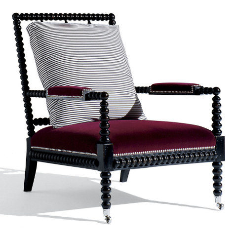
Helen Cotton Spindle Armchair, Black
via
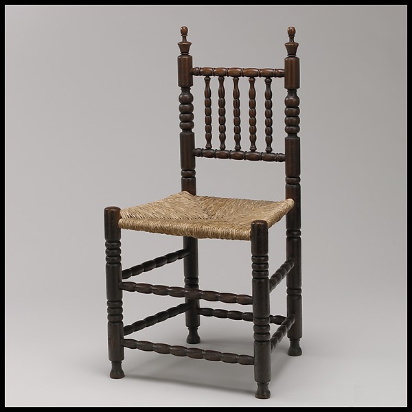
So, Spindle Chairs aren't exactly new or anything. They're pretty darn trendy these days, but they've been around for a long time....like a REALLY LONG TIME.

Spindle-back chair
Antique Spindle Back Chair
1680-1710
The Metropolitan Museum of Art

The upholstered, accent chair version is what is really hot these days.
Here are my favorite finds.

SPLURGE

Williams Sonoma Home
$1295

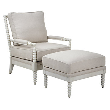
STEAL
Z Gallerie
Chair $499.99
Ottoman $249.99


SPLURGE

Horchow
$1279.20


STEAL

SPLURGE
Neiman Marcus
$1599

STEAL

SPLURGIEST

Monday, August 25, 2014

Monday Musings {Link Love} Late Summer

So many Coastal homes have this floor plan. It's brilliant. More architects should incorporate the Upstairs/Downstairs 
Upside Down
 Flip Flop!

http://www.mixandchic.com/2014/07/home-tour-beautiful-upside-down.html?m=1

No hassle home made ice cream. YUM.
And it's simple but it makes you look all fancy and gourmet and such. 

No-Churn Vanilla Ice Cream Recipe - perfectly creamy vanilla ice cream made without a machine! So easy and only 3 ingredients! | LoveGrowsWild.com

Some days you need encouragement...some days others need a gentle nudge. 
SO, be the good, why don't you?


Be The Good <br> graphic t-shirt

Fabulously pretty and child friendly end of Summer treat!

watermelon ginger sparklers I howsweeteats.com

I've followed Greige Design for years....if I had to pick ONE STYLE as a favorite, 
this would be it for me!
http://www.stylemepretty.com/living/2014/08/25/rustic-elegant-home-tour/


Friday, August 22, 2014

Pinterest Board Spotlight: Dude Decor {Rebel Giant Room}

This is all about James Dean coolness (without trying TOO hard to be cool).

Retro/Vintage 1950's,  Western, Manly Vibe.

I took most of my inspiration from the picture below and from my favorite 
James Dean movie, GIANT.

James Dean in his W 68th St NYC Studio apt, 

where he lived in the early 50s...look at all those books!!! 


James Dean in his W 68th St NYC Studio apt, I know he's not reading but this IS HIS APT where he lived in the early 50s...look at all those books!!! See google for more fab pics from Life Magazine article

I seriously died when I saw the wider version of this picture...because I had already decided that this James Dean room needed Mounted Longhorns...and then I stumbled on this wider picture of the same shot...and ZING! Mounted Longhorns!

  Follow Amy's board Dude Decor: Rebel Giant Room on Pinterest.