Monday, November 30, 2015

Contributor: Art of Manliness Holiday Gift Guide


I was so excited to be asked to contribute to The Art of Manliness Gift Guide: 50 GIft Ideas for the Woman in Your Life!   AoM is one of my favorite sites! Head over to check out some great ideas for timeless gifts that several bloggers (The Every Girl, Darling Mag, Centsational Girl)  + Art of Manliness Editors have gathered for Manly Men to gift their ladies (YOU) this year. 
XO,

Kings Peak House Renovation: Vol I


Our new home is coming along. Its been a Summer of living through construction, but we are turning the corner on some major projects. Here are a few snapshots of some of the spaces that I've designed for this Rambler turned "Lakehouse" with a cozy, relaxed vibe for our family of 6.

When working on the design for the kitchen, I tried to utilize the space in the most functional way. Sometimes "OPEN" isn't always best. I carved out part of the kitchen for a BUTLER'S PANTRY. It will have the same WHITE OAK flooring that is throughout the main living areas. I've planked the walls and will be lining them with shelves, hooks and a functional MOM DESK to serve as a school work organizational station for all of the stuff the kids bring home.


I'm a white kitchen lover and think that they are timeless and classic. But I also love GRAY CABINETRY. This kitchen is GRAY and it is pretty dreamy. The kitchen is in the back of our home and all of the spaces off of the kitchen (Great Room, Eating Nook) will be less formal. We're really playing up the Lakehouse look in here, aiming to create a hangout for kids and their friends as well as informal spaces within the space for casual use.


And here is a pic of all of the many things that are going on in the Great Room.
Planked and Beamed Ceilings.
Built-in Cabinetry.
New Fireplace and Hearth
I can't wait to show you the rest of the details including the Quartz fireplace hearth and what will be a painted white brick fire surround.


The entry of the home will be a bit more formal in a laid back sort of way. The home has some strange architectural features that we tried to change but in the end, we realized for several reasons, we had to accept and work with them. My way of accepting is sometimes still changing just about as much as I can....and we did. Here is a shot of the stair well from the front entry. I can't wait to share before and after shots of this space. There was a closet right where we are looking. It was so weird. So happy that we opened it up and that the dated stair details are being replaced with Newel Posts that I designed to coordinate with the new fireplace details.


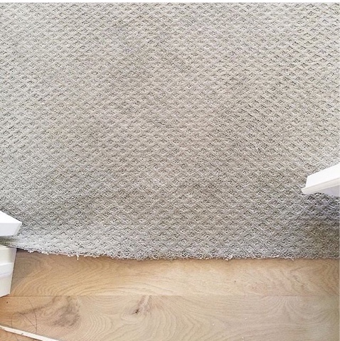
The stairwell was originally an eye sore. Because we had to live with the wonky positioning, I wanted to give it a facelift that would actually make it an interesting architectural feature of the house. One of the main things that I thought would up the street cred of this basement stairwell that is visible from every area of the main floor, was to choose a carpet that would give it it's own character. I selected this Hotel Grade Herringbone that is honestly, one of the coolest features of the home now.


And in the same entry area, the WHITE OAK configured in a 5" Herringbone pattern, adding a tad of formal sophistication in a timeless application.


Just off the entry will be our Library Reading Room. With 4 kids we needed to make a Formal Living Room still WORK for us. Part of my design mantra is to create FUNCTIONAL, USABLE SPACE so I tweaked the typical Living Room to accomodate more of a Library/Computer/Reading Room functionality. This massive built-in will be used daily by the kiddos but it will also feel right at home in this Library atmosphere. 2 Olive/Grayish velvet tufted swivel chairs will work double duty, swiveling between the computer built-in and a comfortable seating arrangement that will be on the opposite wall. An 8 foot window seat with cushions and pillows will round out the cozy "grab a book" feel that we are going for in this space.


In the bedrooms, I used a neutral gray cut loop diamond pattern. 


And every single window was framed, trimmed and now has sills. This is a low cost, HUGE BENEFIT design project that DIYers can do for as little as $20 a window. It brings an added level of detail and seriously elevates the whole space. Seems silly, but it's like night and day. 


So, there is my little update on our MASSIVE RENOVATION. I'll be sharing more including sources and I'll be getting to the moving in and decorating phase soon (HOPEFULLY)!
And see my Kings Peak House Design Idea Board on Pinterest for more inspirational ideas.


Tuesday, November 24, 2015

Tuesday Ten {11.24.15}

Here are my FAVORITE links that I couldn't wait to share with you this week!

1. Zucchini Carrot Muffins. The PERFECT make ahead breakfast for Thanksgiving morning.
I make them every year.
Zucchini Carrot Muffins Recipe

Holiday Table Setting || Studio McGee Holiday Table Setting || Studio McGee Holiday Table Setting || Studio McGee

3. Tudor Home Tour: Normandie Heights Honeypie.

Spaghetti Squash with Kale


6. Julia Child's Provence home for sale. If I could have a wish come true, this little escape might be what I'd wish for. SERIOUSLY.

7. Browned Butter Pecan Pie: from Sinclair and Moore. Everything and I mean EVERYTHING they do is spectacular. This is now my go to Pecan Pie recipe.
Sinclair & Moore Pecan Pie 6

8. Fireside Winter Warmers: A fun little playlist via Anthropologie.

9. Decorating with Metallics: Caitlin Wilson Design.
Galley Wall


Wednesday, November 4, 2015

Wednesday Inspiration {Benjamin Moore "Classic Gray"}


classic gray    OC-23  Light Reflectance Value (LRV) of 78.4 and a Warm undertone:
Classic Gray is a VERY pale, warm, soft gray with a high reflective value. It has sort of a greige undercast to it. Best in direct light. (Can look dirty cream in indirect, poorly lit areas, best teamed with clean, warm whites). It can read as so light that it is white in some lighting. Not every room, in my opinion, can pull off Classic Gray, but if your are leaning towards a barely there warm beigish gray, or are trying to achieve a European/Scandinavian look without feeling cold or stark, this could be just the warm gray for you.

via Studio McGee

Gray Bedroom Benjamin Moore Classic Gray. Benjamin Moore Classic Gray. #BenjaminMooreClassicGray
via
Benjamin Moore wall color: Classic Gray  Trim: BM White Dove:  Linda Bond’s house:
 Linda Bond Home Tour via The Washington Post
9 Pictures of the cutest Chevy Chase,  Maryland Tudor, with Classic Gray keeping things
light and airy.

Wednesday, October 28, 2015

Vintage Style Collaboration with Canary Jane and Maeberry Vintage{Halloween for Fashion Lovers}

Ok, I really stepped out of my comfort zone for this one, friends. 
But when I was approached to participate in a fun, vintage, "fashion through the ages" photoshoot collaboration organized by Canary Jane, I thought, WHY NOT?! Especially with Halloween coming up! I thought it would be fun to find a Betty Draper sort of late '50's House Wife/ Cocktail party dress to style up for a costume. I hardly ever wear makeup let alone red lipstick and false eyelashes, but it was fun to step back in time and get dolled up.

If you've never been to MAEBERRY VINTAGE, lets just say it is on my list of favorite vintage stops in Salt Lake City. Pop in and say 'hello' to Rachel, owner of MAEBERRY VINTAGE and check out her amazing collection of vintage goodies.  I love stopping in to see what treasures I can find there. In fact, its right near my favorite vintage furniture store, THE GREEN ANT. You can see that we stopped in to The Green Ant in some of the pictures below.  


1950's Silk Shirt Dress: Maeberry Vintage
Earrings: Maeberry Vintage

Shoes and other jewelry: my own

Other Model/Bloggers clothing: Maeberry Vintage

My makeup: Catie Yocum
My hair: Catie Yocum


Print by Canary Jane Etsy Shop {10% off w/ code ‘Maeberry’}
Shoot Organized by Natashia of Canary Jane

40s blogger: Syna Harris
50s blogger: me 

60s blogger: Cecilia Harvard

70s blogger: Natashia McLean

80s blogger: Sarah Tripp 

wednesday inspiration {Benjamin Moore, Brittany Blue}

brittany blue - 1633 / another great BM paint selection for you from jannino painting + design boston/cape cod ft myers/naples clearwater/st pete - call us to get it done affordably!

A sophisiticated pale blue with a touch of gray when in indirect light. Brittany Blue is a beautiful amost French Blue, thus its name. 
Benjamin Moore Brittany Blue:
Suzanne Kassler's Showroom
via

Wednesday, October 21, 2015

Wednesday Inspiration {Benjamin Moore, "Wasabi"}


Benjamin Moore - Wasabi (accent wall family room)
Chartreuse.
Wasabi.

Gone is the Frenchy Soft Silvery Sage Green of Restoration Hardware circa 2005. "Wasabi" has a fantastic undercurrent of brightness, yet it still reads as sophisticated and not neon or Pre-School Spring Green. I prefer shades of green with this much kick when used as an accent on doors, cabinetry, moulding, for some reason, I'm not a fan of this type of chartreuse used in mass as a wall color, primarily because when using that much of this sort of strong color, you have to assume that it will reflect and change the tone of the light in the room. And I think that is too much Chartreuse, unless you are going for a kitchy, mid-century vibe. But a stroke of it here and there, adds quite a bit of charm and character. I guess, in my opinion, "Wasabi" is perfectly named...think of the Japanese condiment and use this for a bold kick in a spare or restrained sort of way...just here and there for a bit of WOW! 
Houzz Tour: A Transformed Carriage House Opens for Play..With a new, open plan, a dark workshop becomes a welcoming ‘play barn’ in the Vermont countryside:
via
via

Door Color - Benjamin Moore Wasabi AF-430 Paint:
via

Wednesday, October 14, 2015

Wednesday Inspiration {Benjamin Moore, "Onyx"}

I'm so excited about a change that I'm making on Wednesdays...starting TODAY!
Wordless Wednesday Inspiration will be Wednesday Inspiration from now on.  I'll still continue to share my favorite paint colors and wall coverings BUT I'll be sharing why! So many people ask me for color advice and my answer always is that you can't just chose a color off of a pinterest board. You have to see it in a space, with the lighting you have and the other elements in the room. Pinterest and Houzz and blogs like mine should be starting points, not decision makers when choosing paint colors. I have worked with companies where I've specifically written color descriptions and although it may not be my favorite thing to do (because it is quite challenging actually), I think it's so important to describe colors rather than just go off of what they may appear to be on your screen. I hope this new direction is a helpful one for you.

Onyx by Benjamin Moore: Daniel and Max used this paint all over their Brooklyn apartment and LOVE IT. It was what inspired me to paint our home black and the results they got on their doors were well worth the effort.:
This Charcoal Black is the perfect soft black. Not as bold and rich as a true black, ONYX has a warmth to it that works perfectly with lighter oak floors. It gives you that black contrast in a muted way (without overpowering).  It is very close to BLACK SATIN, but ONYX is still a touch more subtle. (It's A LOT like my other favorite shade of black, Farrow & Ball's OFF BLACK). 


Need a sleek and sexy black to paint your front door? Use #BenjaminMoore #Onyx paint to get the job done!  #paintzen: All the doors were painted Onyx, another favorite shade of mine. It's a black with depth - a lot like Farrow and Ball's Off Black (but witho...: