Today I'm sharing with you one of my favorite designers:
Holly Mathis. She lives in TX and has quickly become a hot commodity. Put your feet up, stay a while!We are House Guests in one of her clients homes, a farmhouse in Louisiana.
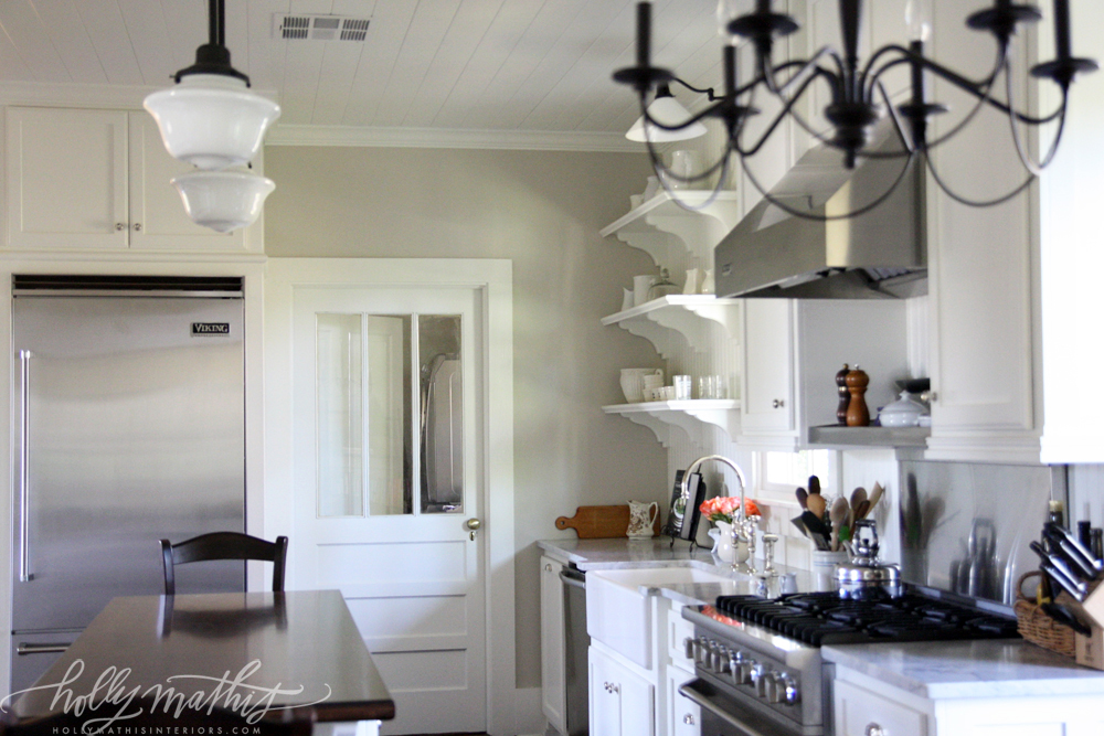 |
Fabulous white and pale gray kitchen. With stainless steel and iron accents.
The light fixtures, the open shelving, the tongue and groove ceiling, the marble counter tops, what appears to be a stained wood top to the island. |
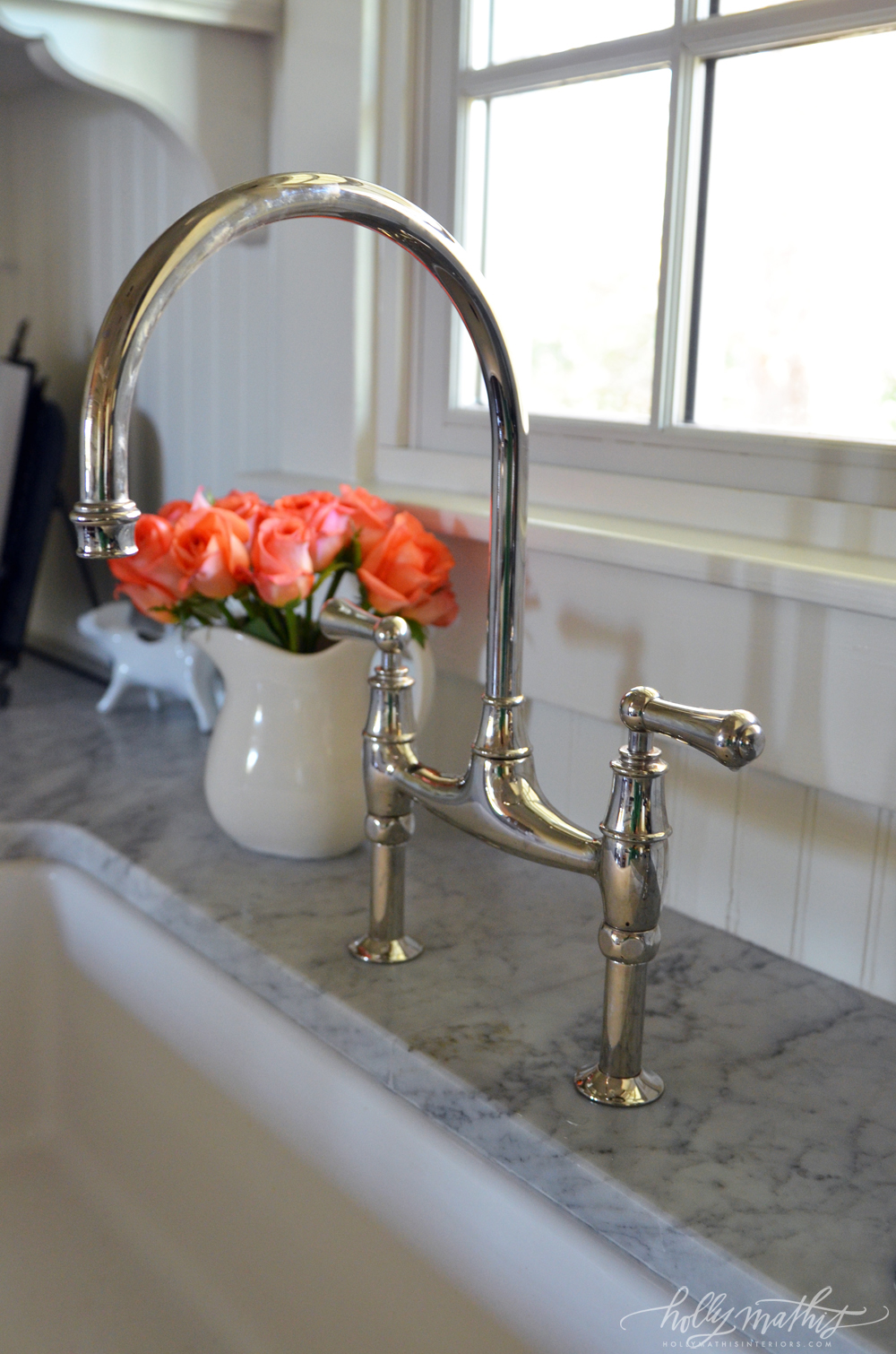 |
| Love the stainless/chrome goose neck faucet with flush mount, farmhouse white sink. Great close up of the marble counter tops. Beadboard backsplash. |
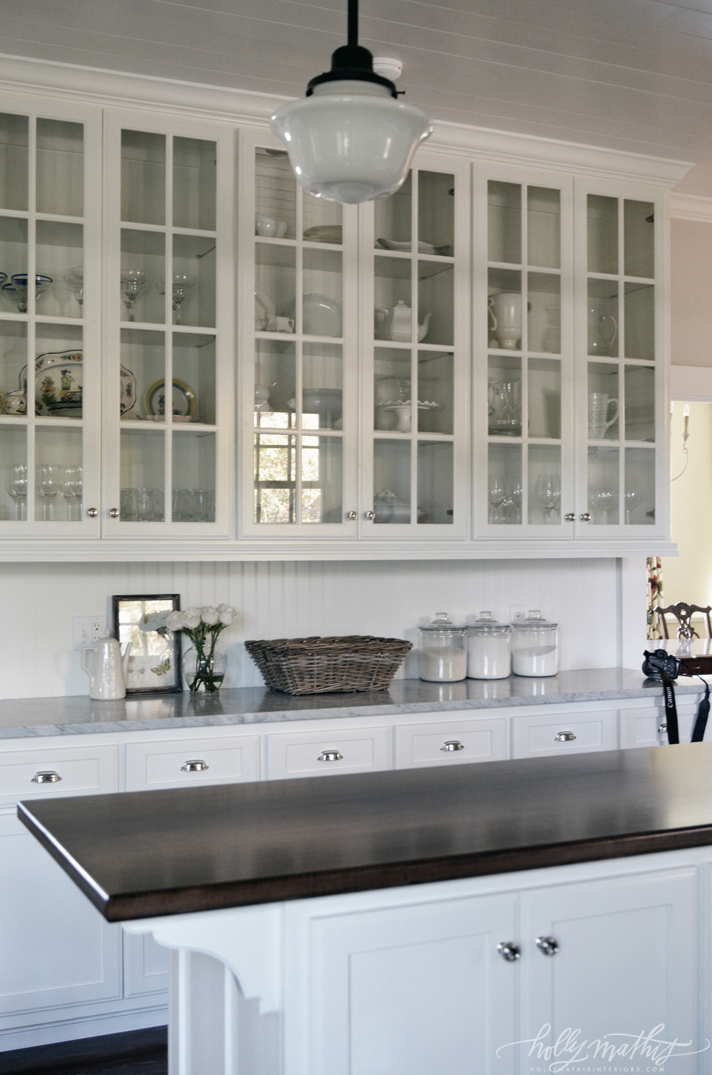 |
| Wall of glass door cabinets opens space up, allowing for displays and reflection...keeps space light instead of feeling closed in. Beadboard back splash. Great view of chrome/stainless steel fixtures. Shows contrast between marble counters and dark stained top to the island. Also, don't you just love this milk glass pendant light ?! |
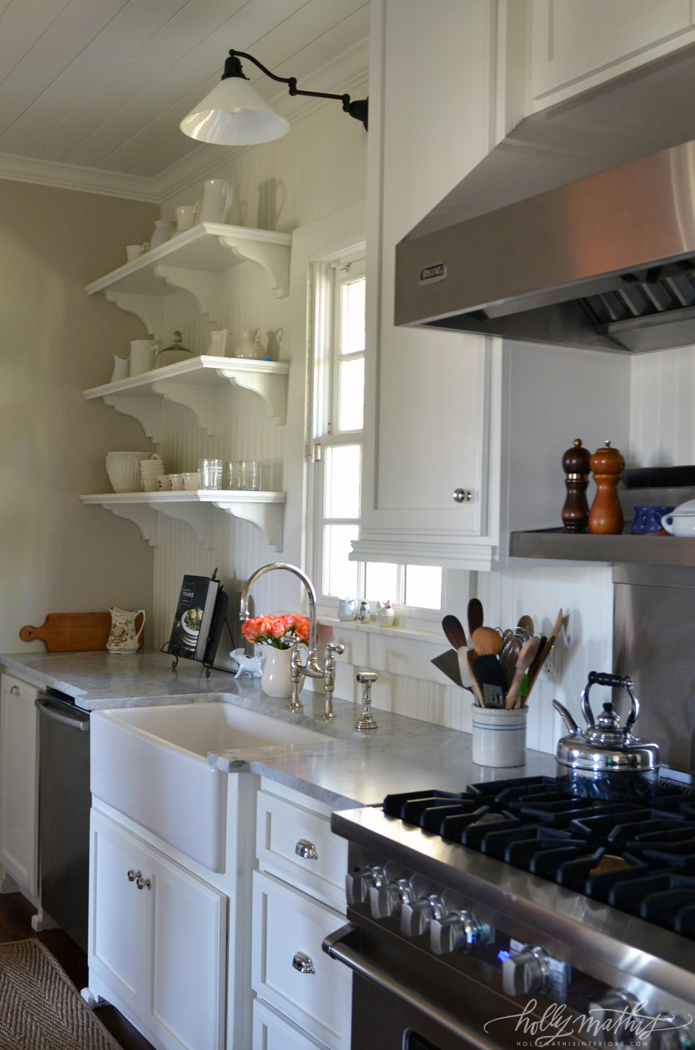 |
| Open shelving, flush mount (undermount) farmhouse sink, goose neck faucet, chrome fixtures, cool milk glass wall mounted sconce over sink area and THAT RANGE...all = farmhouse vibe awesomeness |
 |
| Traditional cane back chair updated with what appears to be chalkpaint detailing/destressing and a fresh royal blue gingham check, and CHECK the beadboard, a running theme throughout the home. |
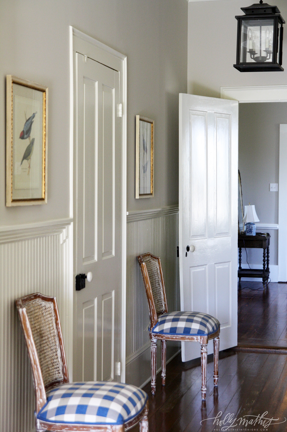 |
| Lovely bird prints, beadboard with hefty chair rail moulding, iron pendent...Looks like PB Lantern. |
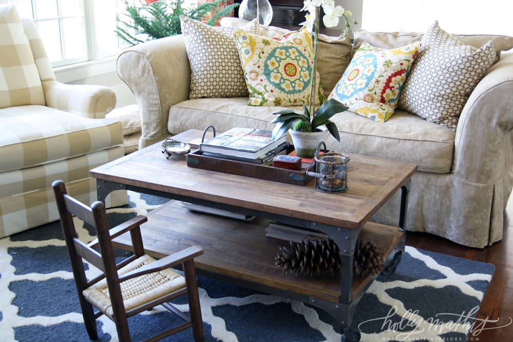 |
| Casual space...mixing linen, check, quatrefoil and suzani print pillows with blue tile rug. I like that t isn't too matchy-matchy. More casual look. Fun table. Not too over styled. Pine Cone is a nice natural touch. |
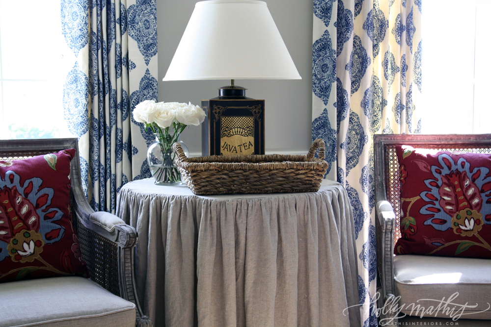 |
| More formal area. Love that she used the bold print on the window panels and the linen on the table cloth. Fun pillows bring the homes red, natural and blue color way together. Lovely cane chairs. |
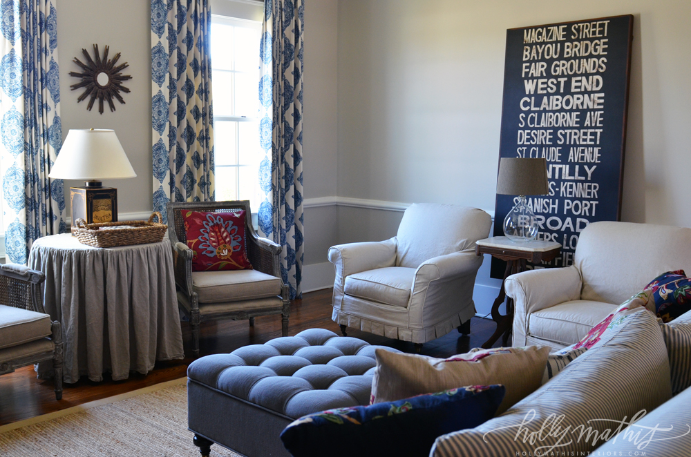 |
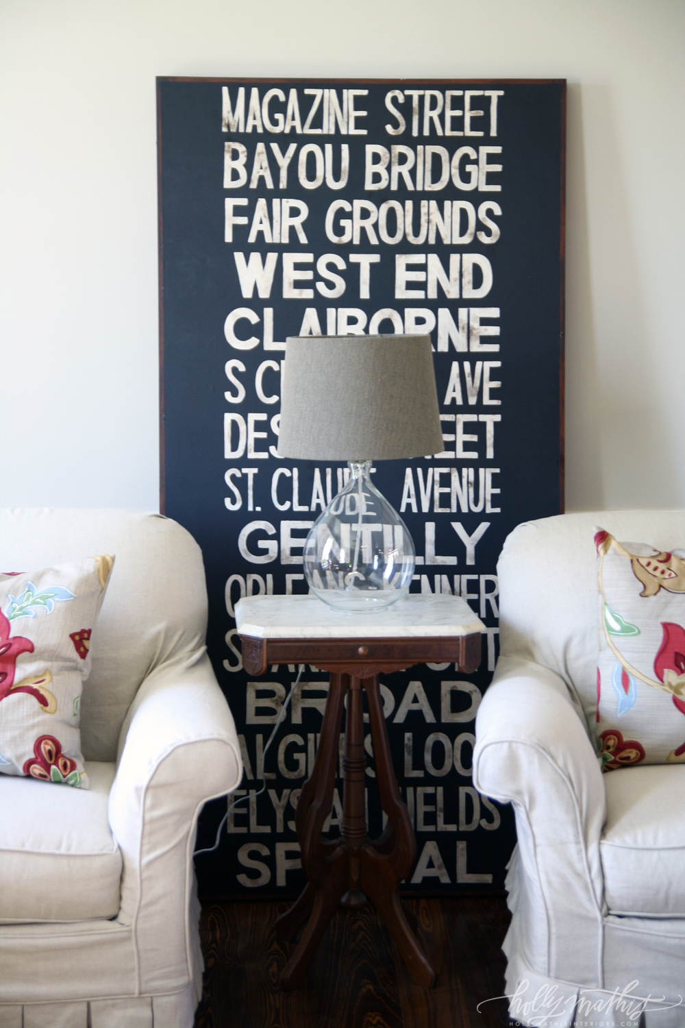
| Larger view of the formal living area. The linen table cloth and pleated slip covered chairs keep things soothing on the eye, and gives the eye a place to rest. Love the large Subway art. Brings a pop of something graphic, unexpected and up to date into the space. Tufted square ottoman is nice touch to pull in the curtains. And you almost miss it from this angle, but this sofa appears to be blue ticking stripe. LOVE. |
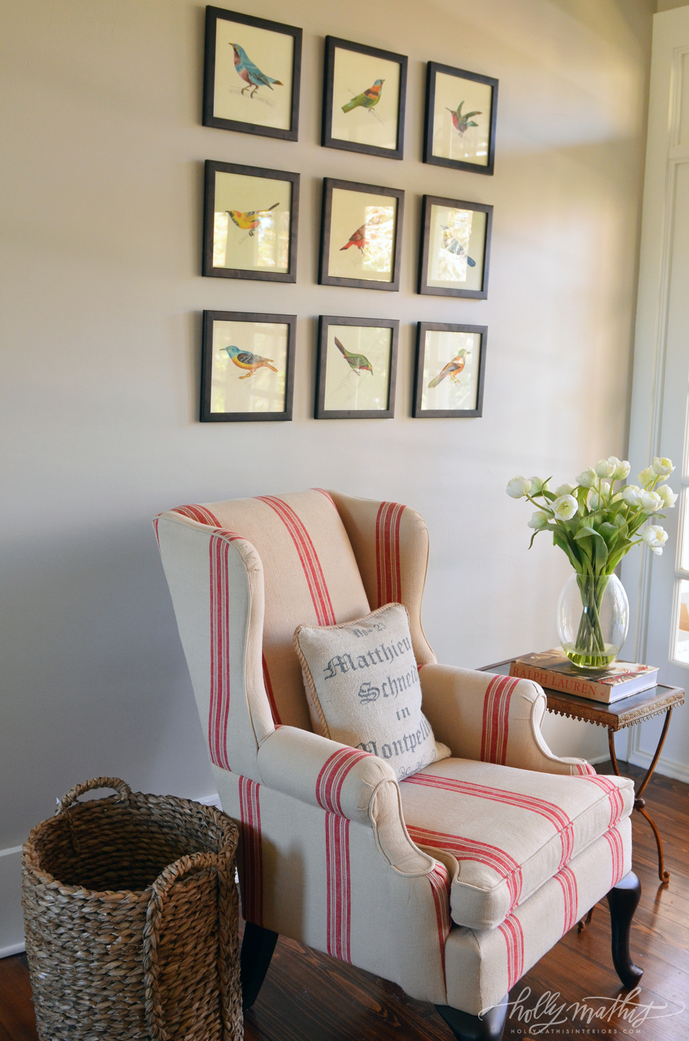 |
| Fantastic bird prints, Red French ticking on wingback, light table and light artwork keeps the wingback from being too heavy for this small space. Again, natural basket helps keep it from being too formal. |
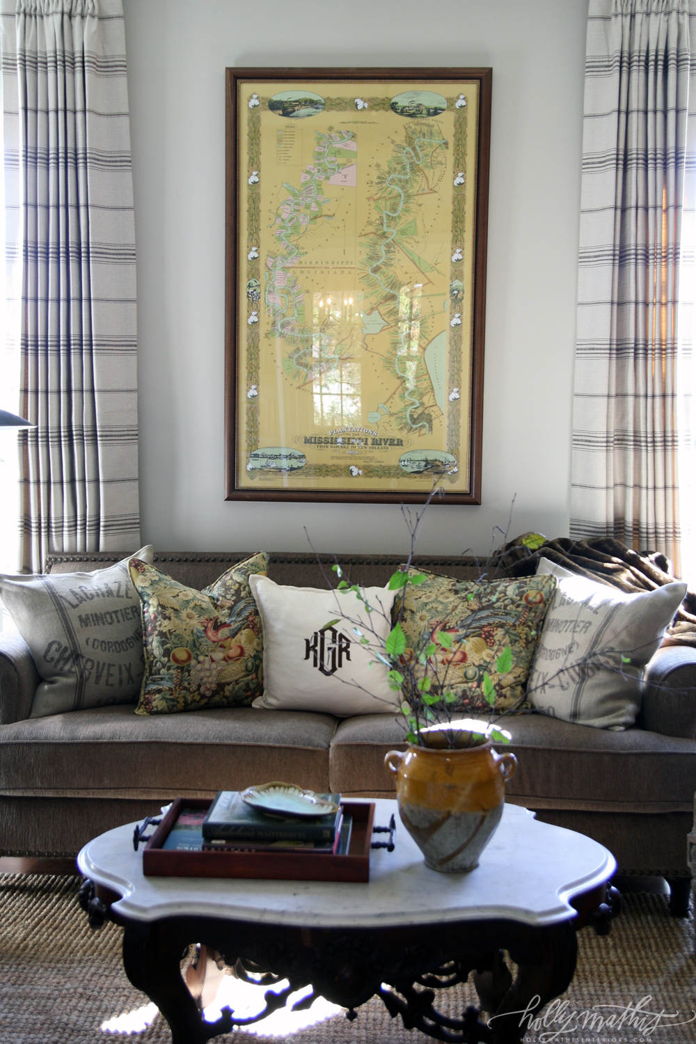 |
| Another more formal space. Digging the map, the sofa and french ticking and grain sack pillows. Monogram is a nice fresh touch. The marble top table is Victorian and more formal, but again, kept light with a natural seagrass or sisal rug...if you used an oriental, this would be a much more formal/heavier space. Pinch pleat curtains are an interesting choice. I might have gone with something a bit more whispy. |
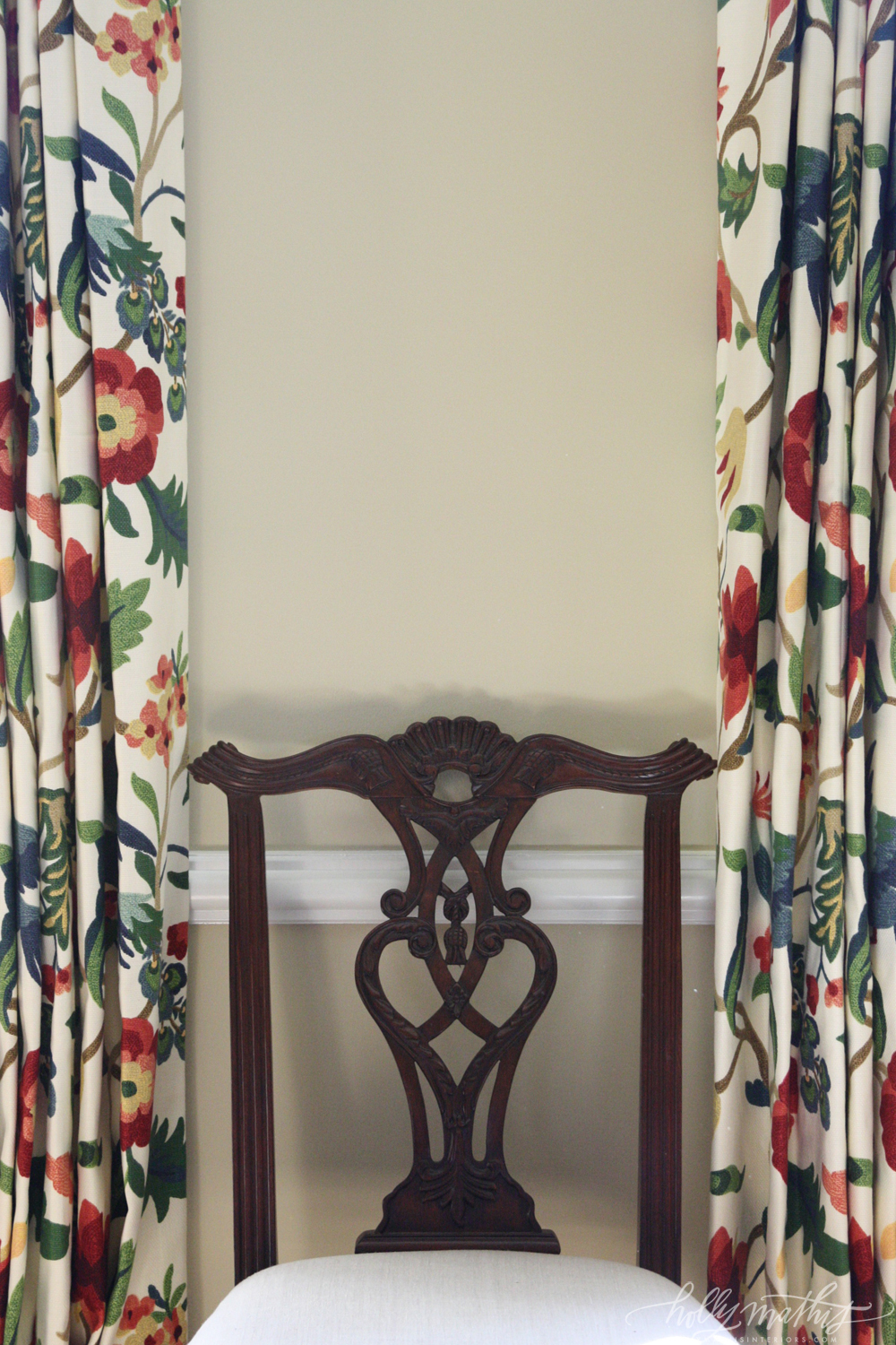 |
| Lovely curtains, again, bold print, simple chair seat for a more ornate Sheraton style chair. |
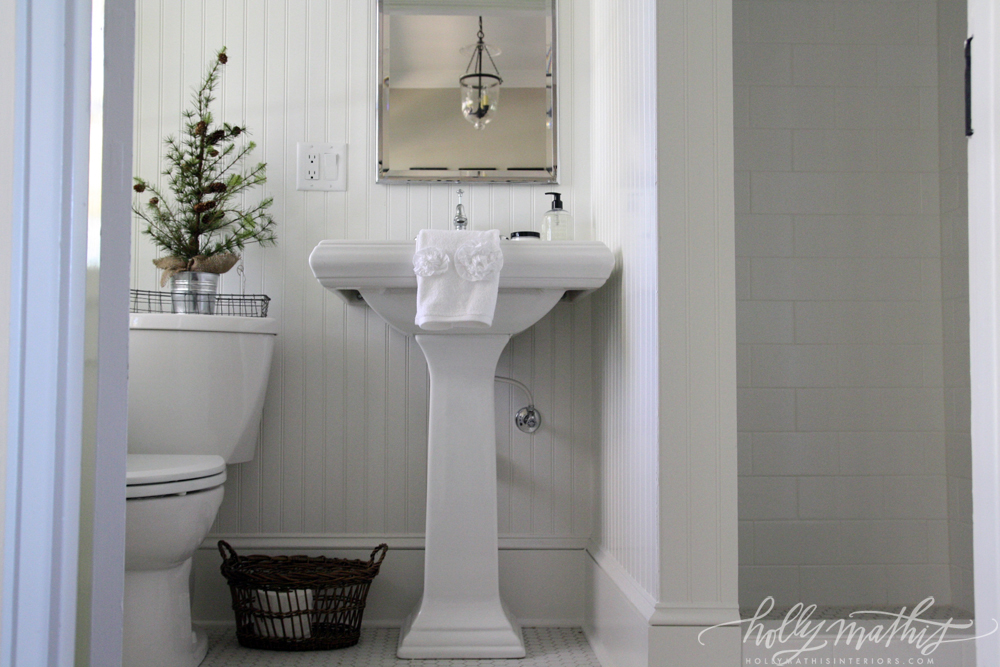 |
| White, pedestal sink, beadboard, subway tile, lantern light fixture, natural basket. |
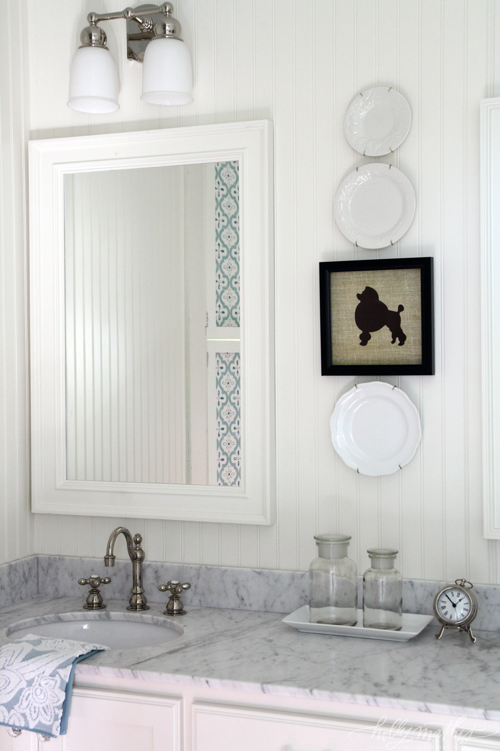 |
Marble counters, beadboard clad walls, hint of blue tile or wallpaper. And who doesn't love a Poodle. Or a Silhouette?
Or a Poodle Silhouette? |
 |
| Mahogany 4-Poster bed, contrasting wood bedside chest instead of traditional night stand, toile pillows, seagrass rug. Gold Starburst mirror. Gray bedskirt, curtains keep things serene. Blue PB lamp adds a bit of color pulled from the toile. |
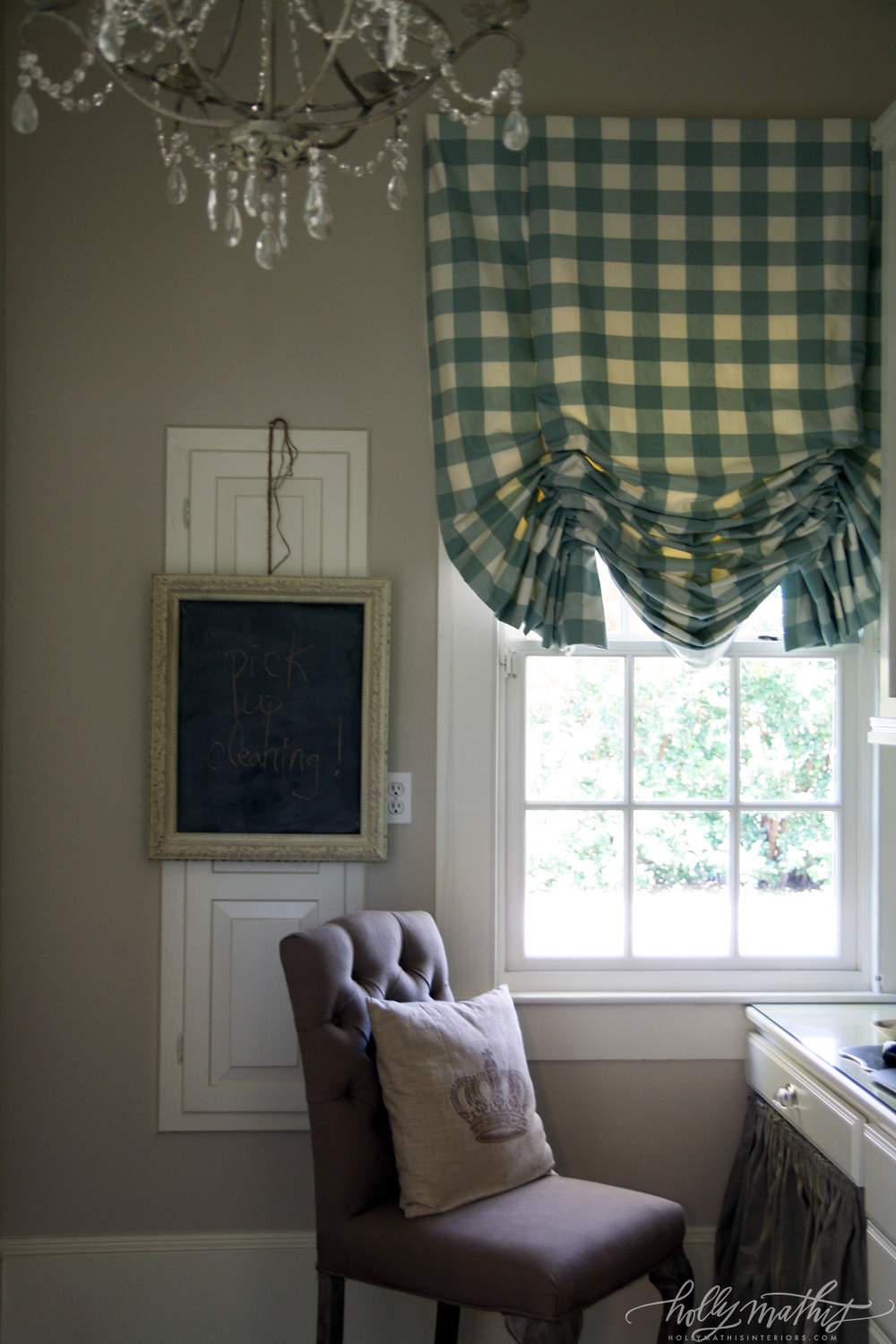 |
| Love the gigham roman shade. Fun chalkboard is functional and makes the panel (ironing board? Electrical panel?) a part of the room instead of pretending it isn't there. Like the skirted desk area. "This is obviously a ladies work spot, " says the chandelier. |
 |
| Gingham and natural-look storage boxes. |
all
via Holly Mathis Interiors
The bold patterns used sparingly, soothing neutrals and simple touches keep things fresh. The graphic subway art and monogram pillow, clean lines, use of solid colors and natural elements throughout keeps this farmhouse from being (too) cutesy, keeping it crisp, elegant and current...even though it obviously draws from the charm of old farmhouse style. It is what new farmhouse style should be!
If you love her style, like I do, check out Holly's portfolio.
XXXOOO.




Such as gorgeous home! There isn't a single element in a single room I don't love! Thanks for sharing! Pinning!
ReplyDeletehi!! don't you though?? I love Holly Mathis. She's down to earth, has great style and consistently combines high end with low end (Target, thrift). She has a great eye for fabrics and knows when to neutralize with natural linen and ticking, etc. I think she has a defined style, but if you go to look at her portfolio, it's still obvious that she works hard to incorporate the feel of the home/architecture and the home owners tastes. Just love her! I love how she uses marble, subway tile and other more timeless choices in most of her projects. Curtain fabric will come and go...but Carrera marble and subway tile will work with anything! I just HAD to include your lamp DIY link under the pic of the glass lamp, which I would bet is TARGET. And not high end, btw, but still $50 at Target. XXXOOO!
DeleteGreat post, and great website. Thanks for the information! moviesflix
ReplyDelete